Bergen Live, Bien (a local restaurant) and Godt Lokalt (an organic food supplier) have joined forces to purchase a street food truck for live events in Bergen, Norway. Bien, which means "wasp" in Norwegian, operates four diverse restaurants specializing in catering services such as burgers, Japanese izakaya, Neapolitan pizza, and traditional meat and seafood.
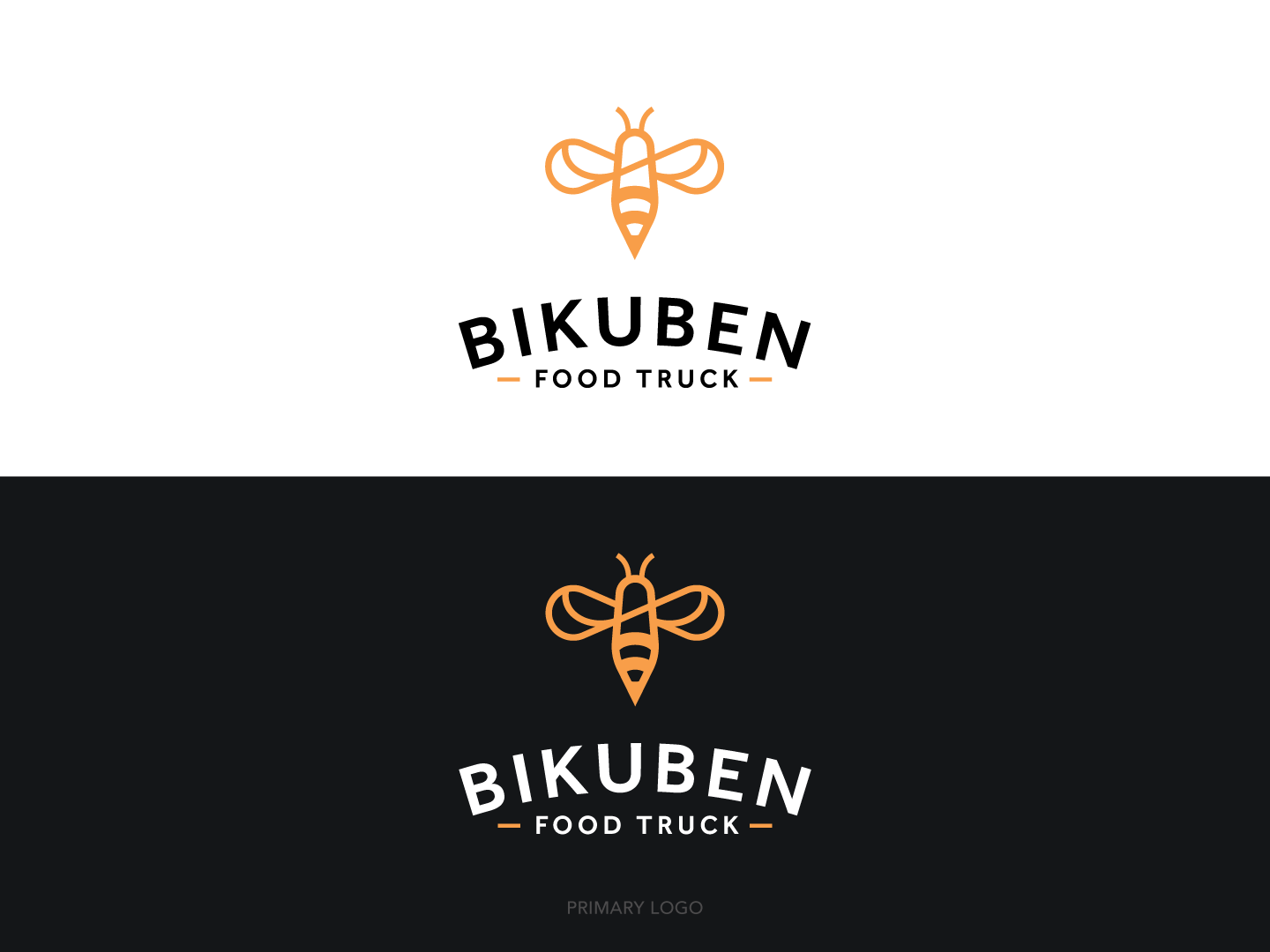
The team approached us to design a new logo and truck wrap for their food truck named Bikuben, meaning "beehive." The desired design needed to be clean, diverse, and approachable, reflecting the truck's diverse menu for catering and live events.
Our solution was to use a bee as the Bikuben brand icon, embodying the bee's creativity and hardworking nature while highlighting the importance of savoring great food. The bee's wings form an infinity symbol, representing endless culinary possibilities. The Bikuben wordmark uses a clean sans-serif typeface that complements the bee icon and stands confidently on its own. We also created a family of logos to include a primary logo, badge and icon to work perfectly with each of their marketing needs.
Bikuben Food Truck
Logo Design | Food Truck Wrap